

Tesla's Design Regression
Tesla's Design Regression
Tesla's Design Regression
Tesla's recent vehicle software updates in 2022 resulted in a step back in usability, favoring visual flatness instead of ergnomic and usable interactions done in everyday driving.
Tesla's recent vehicle software updates in 2022 resulted in a step back in usability, favoring visual flatness instead of ergnomic and usable interactions done in everyday driving.
Tesla's recent vehicle software updates in 2022 resulted in a step back in usability, favoring visual flatness instead of ergnomic and usable interactions done in everyday driving.
🗒️ Note: Tesla is able to send over the air updates to their cars that may remedy issues highlighted in this post. As of this writing, V11 2022.4.5.3 is the most recent version running on the author’s Model 3.
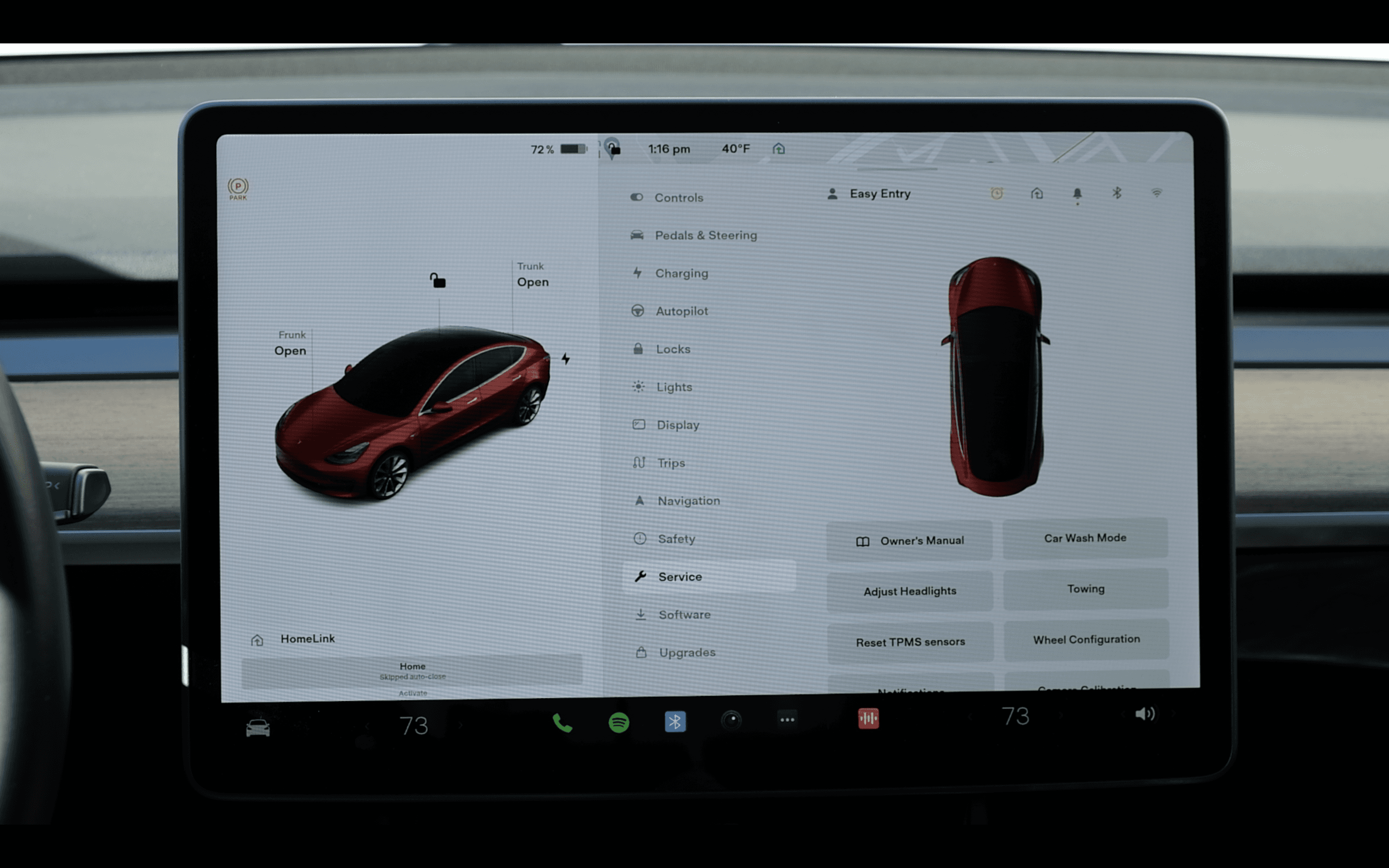
V11’s design update affects all Model 3, Y, and 2021 and beyond Model S and X’s.
V11 via Tesla’s tutorial videos
The Gist
Tesla is on another planet when it comes to how refined and capable their vehicle’s infotainment systems are. Since 2012’s Model S, Tesla owners have had the unique luxury of getting continuous software updates that added more features over time.
Nine years later December 2021’s V11 update resulted in a sleeker, simplified UI that resulted in a far less practical design as it buried basic functionality behind multiple menus.
Given Tesla’s minimalist design resulting in very few physical controls, most vehicle controls live on the center touchscreen. A less usable interface makes for a tougher driving experience. Many Tesla owners have taken notice of this.
After two months of use, this author reaffirms his initials thoughts: V11 takes a big step back in basic usability because of its minimalist design choices.
There’s three primary issues with V11’s design:
Burying numerous, previously glanceable and reachable items into menus such as “Quick” Controls requiring extra taps, and removing heated seats and defrost controls from the bottom bar
Ergonomics, or lack thereof, for the new alerts and gestures that are blocked by the steering wheel
Homogenized UI from previously distinguished buttons/actions, making for a greater cognitive load from the driver to distinguish between a grid of buttons
Context
As a first for the auto industry, since 2012 Tesla can update their vehicles over the internet. No dealership service center needed! Ten years later, Tesla still has a significant lead over the traditional auto industry on their infotainment software (and battery + drivetrain tech for now). Some new features created over the years include:
Using the Autopilot cameras as dashcams
Navigating through streetlights and stop signs on Autopilot
Semiautonomous lane changing and highway exit ramps
Cheetah mode launch stance for performance Model S
Stream Netflix, Hulu, YouTube, and Disney+ while parked
An arcade-worth of classic and new video games playable while parked
Spotify app
Optimize the battery when navigating to a Supercharger
Cold Weather improvements
These only scratch the surface of Tesla’s software chops and granular level of control over every electronic in their cars. Many feature ideas are also crowdsourced by Elon Musk himself and Tesla through Twitter and Reddit.
Until 2021’s introduction of the current Model S and X iteration, the previous models had portrait-oriented Media Control Units, or MCUs as Tesla refers to them - aka the big touchscreen in a Tesla. Model 3 and Y had landscape-oriented MCU’s as shown below:
V9 on Model S & X via Tesla Support
V9 on Model 3 via Tesla Support
V11 marks the first software iteration that had landscape designs align the new Model S and X with the Model 3 and Y. Note that Model S and X still retain the screen behind the steering wheel, similar to most cars.
V11 on 2021 Model S via Tesla’s tutorial videos
V11 on a 2018 Model 3
V11 comes with new additions that continues to showcase Tesla’s significant lead in software sophistication in the auto industry: video game Sonic the Hedgehog, multiple waypoints navigation, customizable immersive audio settings, and even a light show.
Traditional auto makers are at the beginning stages of figuring out how to do over the air updates, and create digital interfaces that incorporate the level of high-fidelity Design Thinking Tesla has done. Meanwhile, two new American EV companies Rivian and Lucid have recently begun deliveries of their first highly rated EV’s, both with well-crafted digital interfaces capable of receiving over the air updates.
Tesla will soon have more competition than ever for digital interface experiences.
Musings
So much of the design changes detailed in sections below point back to 1) an action taking more steps than it was previously, and 2) being more difficult to perform while driving. Are such things tested in the field when prototyping new designs?
V11 may be the apex of Tesla designing for UI, and sacrificing UX to do so. There’s a lack of consideration of non-Bay Area, SoCal climates that merit frequent use of the windshield defroster and seat heaters.
Decisions like putting the Charging menu inside of the monolith Controls menu shows the sacrifice of not weighting the information architecture in favor of significantly streamlining the interface.
Tesla has been the only vehicle maker who has sold vehicles with the potential capability of being fully autonomous someday. Today, a select portion of owners have a beta build of Full Self Driving, or FSD - Tesla’s current most advance version of Autopilot capable of driving in urban and suburban terrain that still requires an attentive human.
Autopilot and the pursuit of FSD’s final form has influenced Tesla’s digital interfaces for the last few years. In response to a design suggestion for V11, Musk responded, “Almost all input is error.”
If Teslas will be autonomous robotaxis, why then would someone need to adjust their AC or have a convenient button to see the Charging menu?
Realistically, we’re still years away from that possibility. Our digital interface experiences shouldn’t suffer during that pursuit.
Buried
Trip & Tire Pressure
Trip Information and Tire information was previously reachable in the lower right area of the screen, inside of the left area of the screen dedicated to all driving-related, active data. A swipe to the left or right in this area revealed the respective “card.”

V10 via Tesla’s tutorial videos
Now, in V11, Trip Info and Tire Pressure live in their own sub pages inside the Controls menu, which now houses Dashcam Status, Sentry Mode Status, Vehicle Notifications, Bluetooth, Cellular/Wifi Bars, and Driver Profile.
Additional taps, and more cognitive attention is needed to get to Trip Info and Tire Pressure. This can translate to time not spent looking at the road while driving (remember, Tesla’s aren’t fully autonomous), making for a less safe drive.
V11, Service screen where Tire Pressure now lives (not shown when vehicle is parked)

V11, Trips Screen
Bottom Bar
V10 and previous versions retained common vehicle controls on its bottom bar: defrost controls, seat heaters, and access to the wiper controls. In dark conditions, the MCU switches to dark mode, along with the color of the Bottom Bar changing.

V10, Bottom Bar via Tesla’s tutorial videos

V11, Bottom Bar
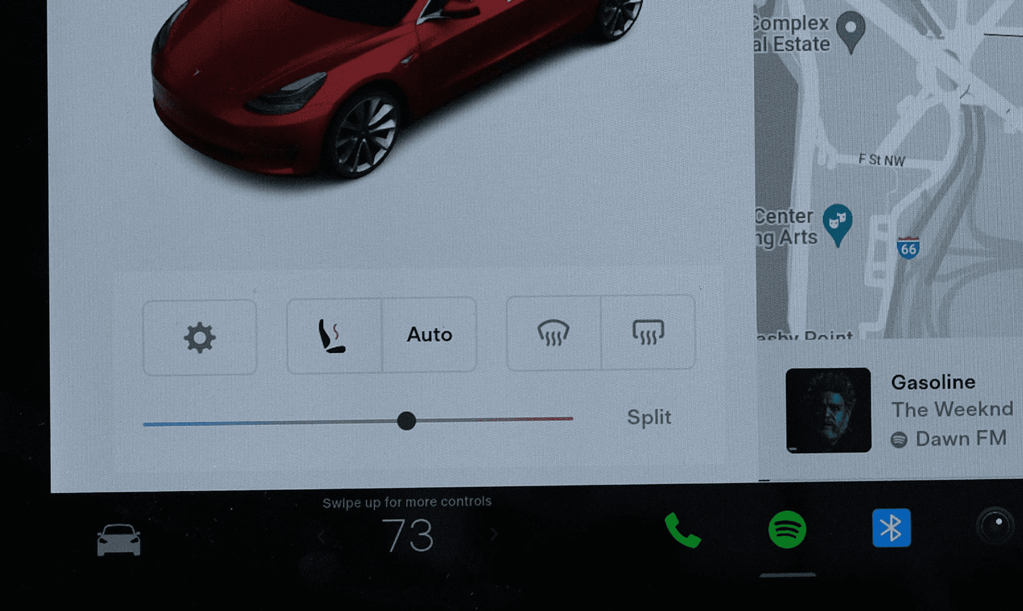
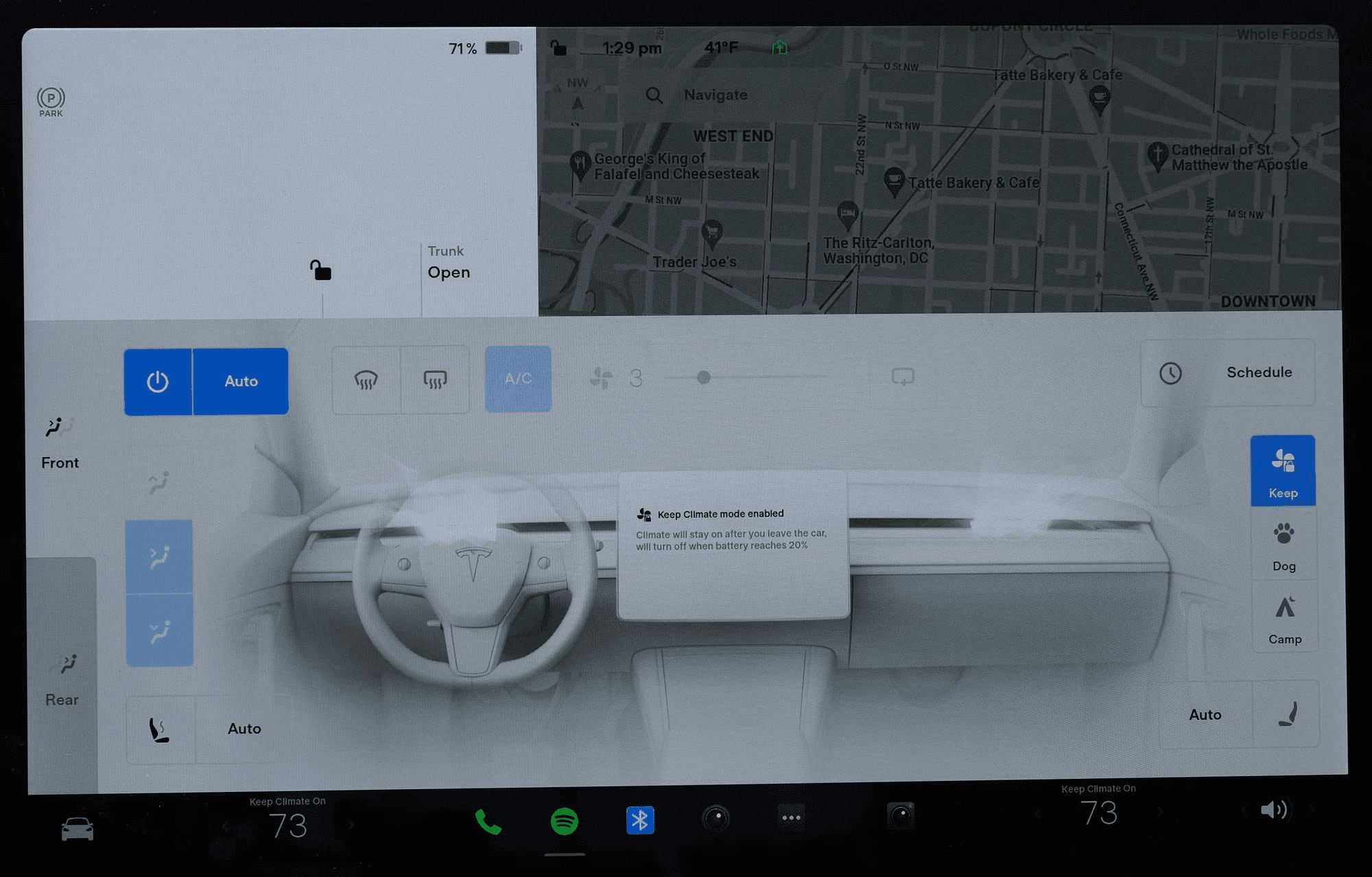
V11 undergoes an ethos of vehicle function minimalism while brining prominence to music streaming services, games, and apps - the latter two are generally unavailable while driving. The always-dark design appears sleek at initial glance, yet can be of detriment in certain lighting conditions and for recognizing the darker colored app icons. Gone are the defrost controls and seat heater controls, now tucked behind a “quick menu” and embedded into the main Climate Control view.
Status Bar
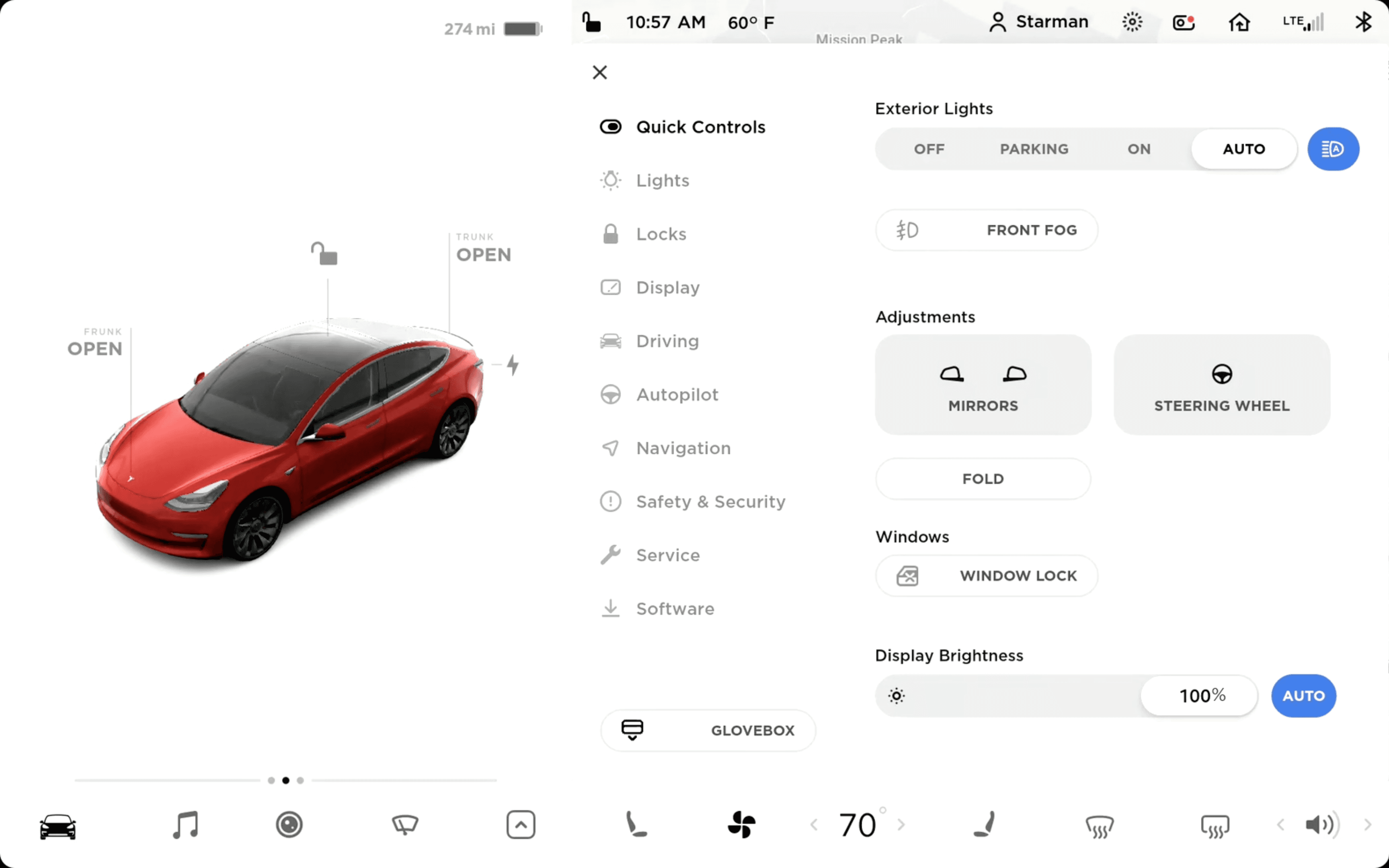
Driver profile, which stores seat, steering wheel, and mirror position along with vehicle settings such as Autopilot preferences, along with HomeLink garage controls, notifications, software update alerts, Dashcam, Sentry Mode, Bluetooth, and Cellular/Wifi connectivity are now inside of the Controls menu.
Accessing any of these functions now requires the extra tap of opening the Controls menu, in which doing so would block the Map view or any previously opened app such as Spotify.

V10’s Status Bar via Tesla’s tutorial videos
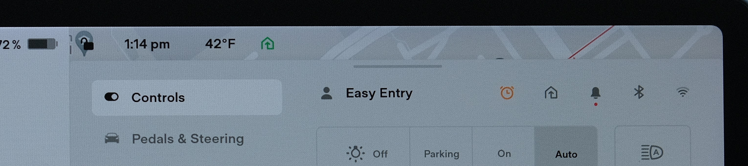
V11’s Status Bar
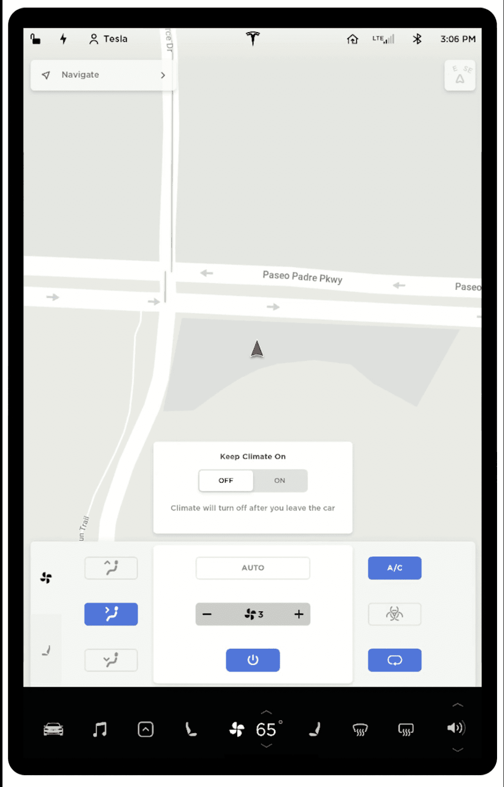
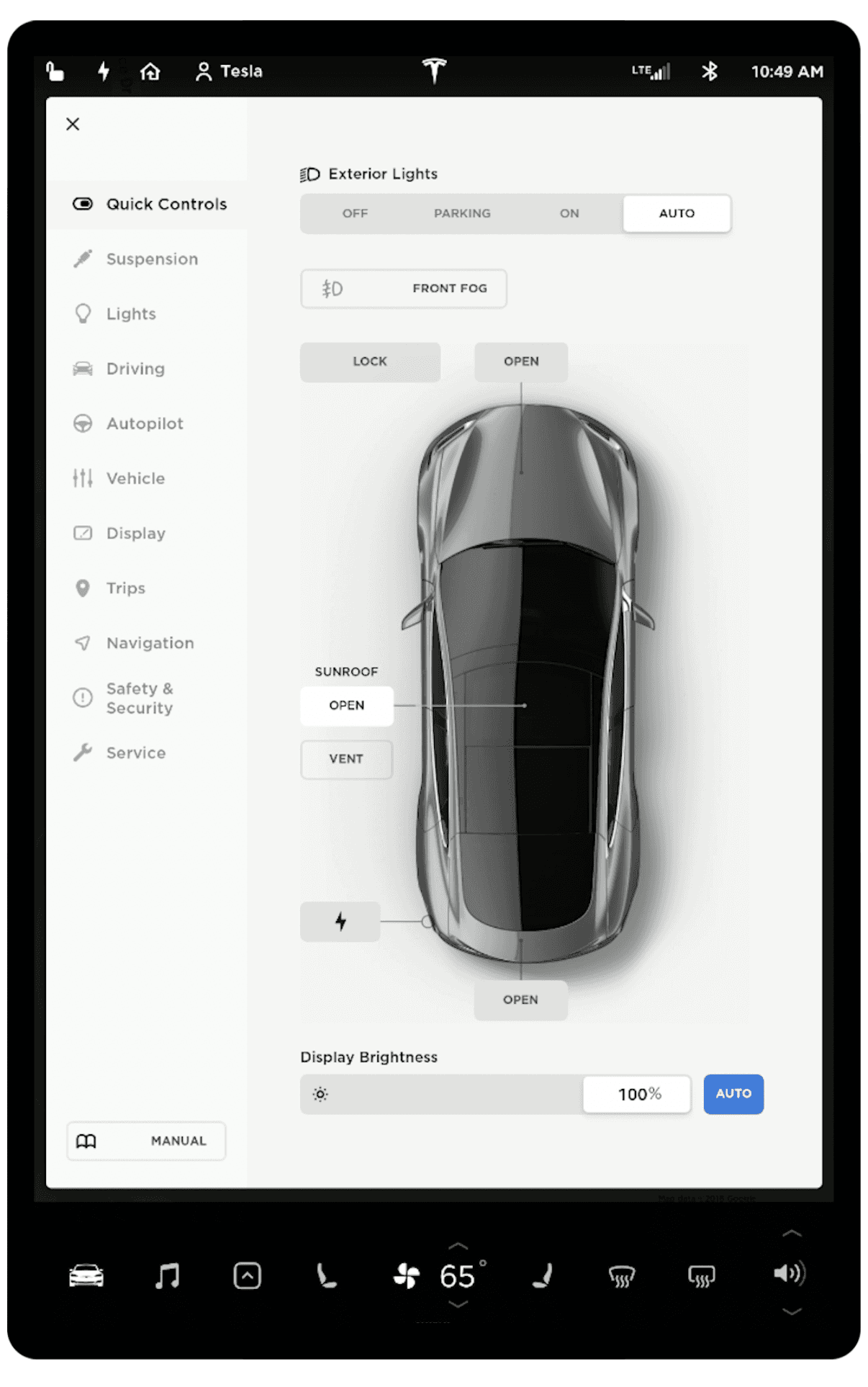
Climate Controls
The climate “Quick Menu” appears after tapping or swiping left or right on the temperature on the Bottom Bar. Seat heater and defrost controls are found here, along with a new Auto mode for seat heaters based on the interior temperature.
Even two months later, reading and interacting with these controls while manually driving, and even on Autopilot, feels disorienting.

Shown below, the seat heater and defrost controls found in the climate “Quick Menu” are also found in the main Climate Controls menu that largely retains its layout to V10 now with squared buttons and toggles.
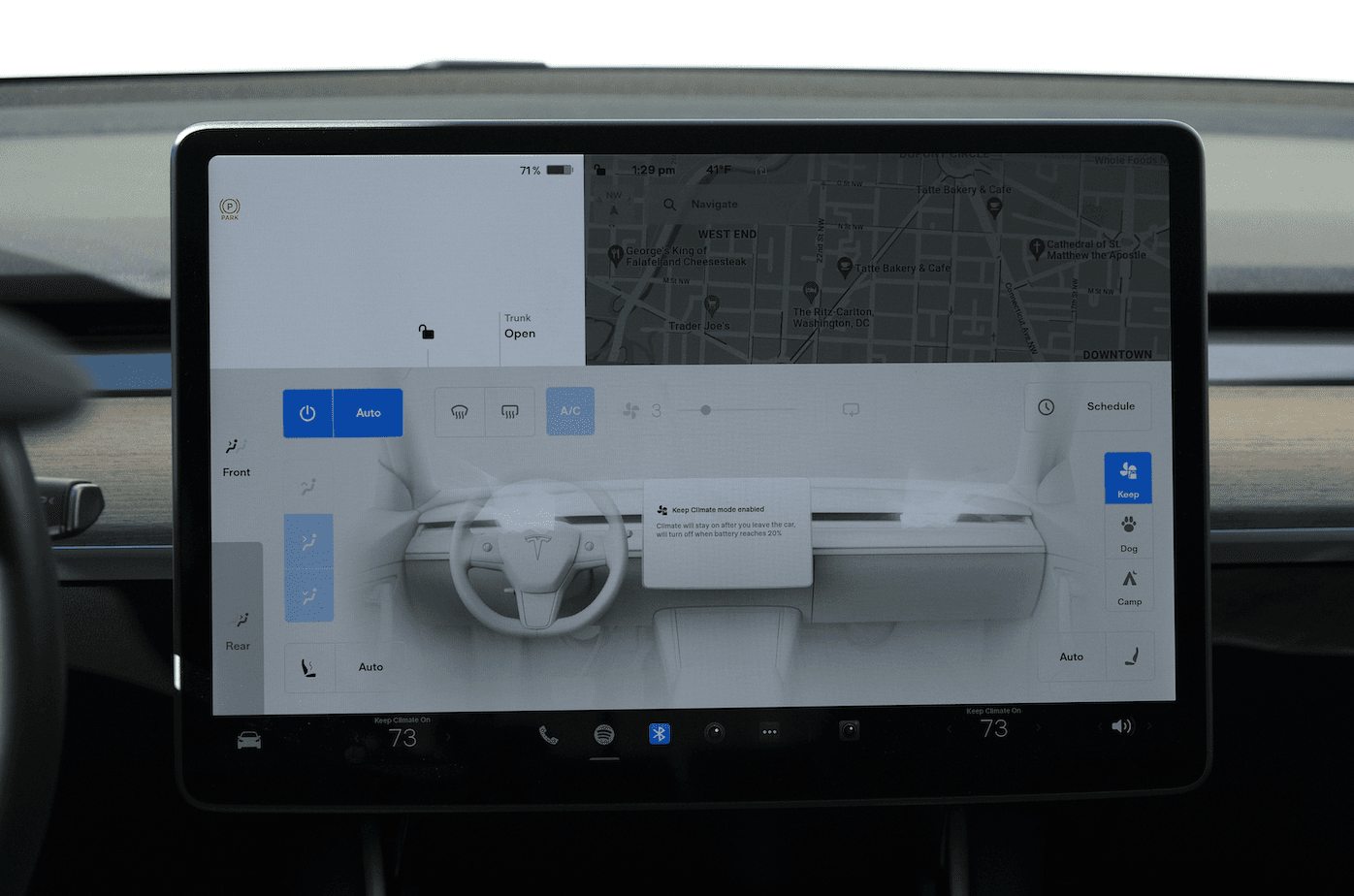
V11 Climate Controls menu
Charging
The Charging menu was previously displayed as its own screen, and reachable by the Bottom Bar’s “extra” menu, and tapping the charge port when parked.
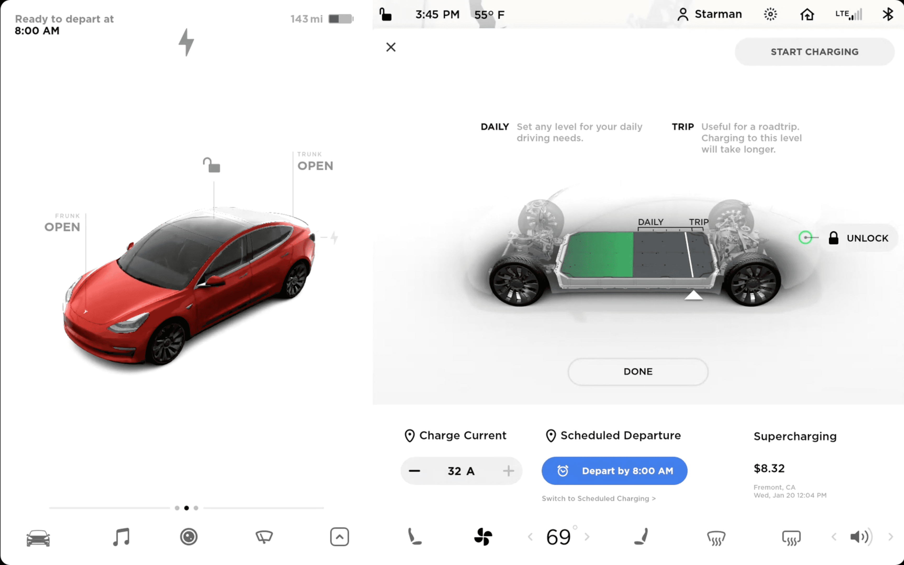
V10 Charging menu via Tesla’s tutorial videos
Charging in V11 is found in the Controls menu as its own section, with a smaller window of information.
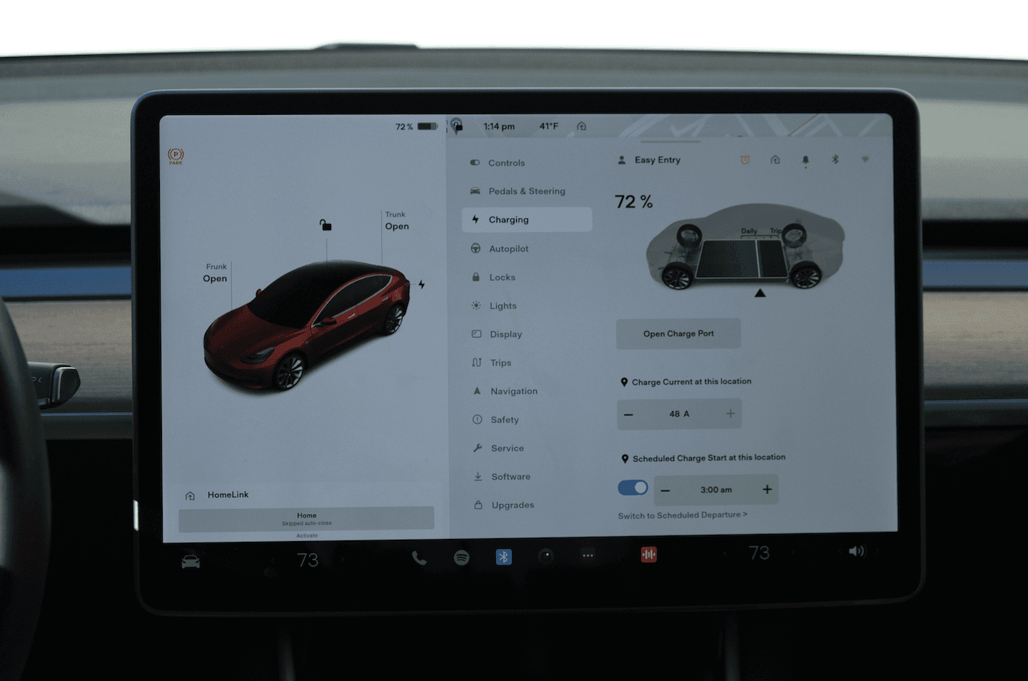
V11 Charging menu
Ergonomics, or Lack Thereof
Blocked: Turn Signal, Alerts, and Climate Control
V11 introduced the ability to use the side fender cameras as a blind spot monitor when the turn signal activated. It was a much-requested feature by owners.
V11’s implementation of it, and other temporary alerts in the lower left corner of the MCU result in the driver generally being unable to view them as his hand and the steering wheel would block it.
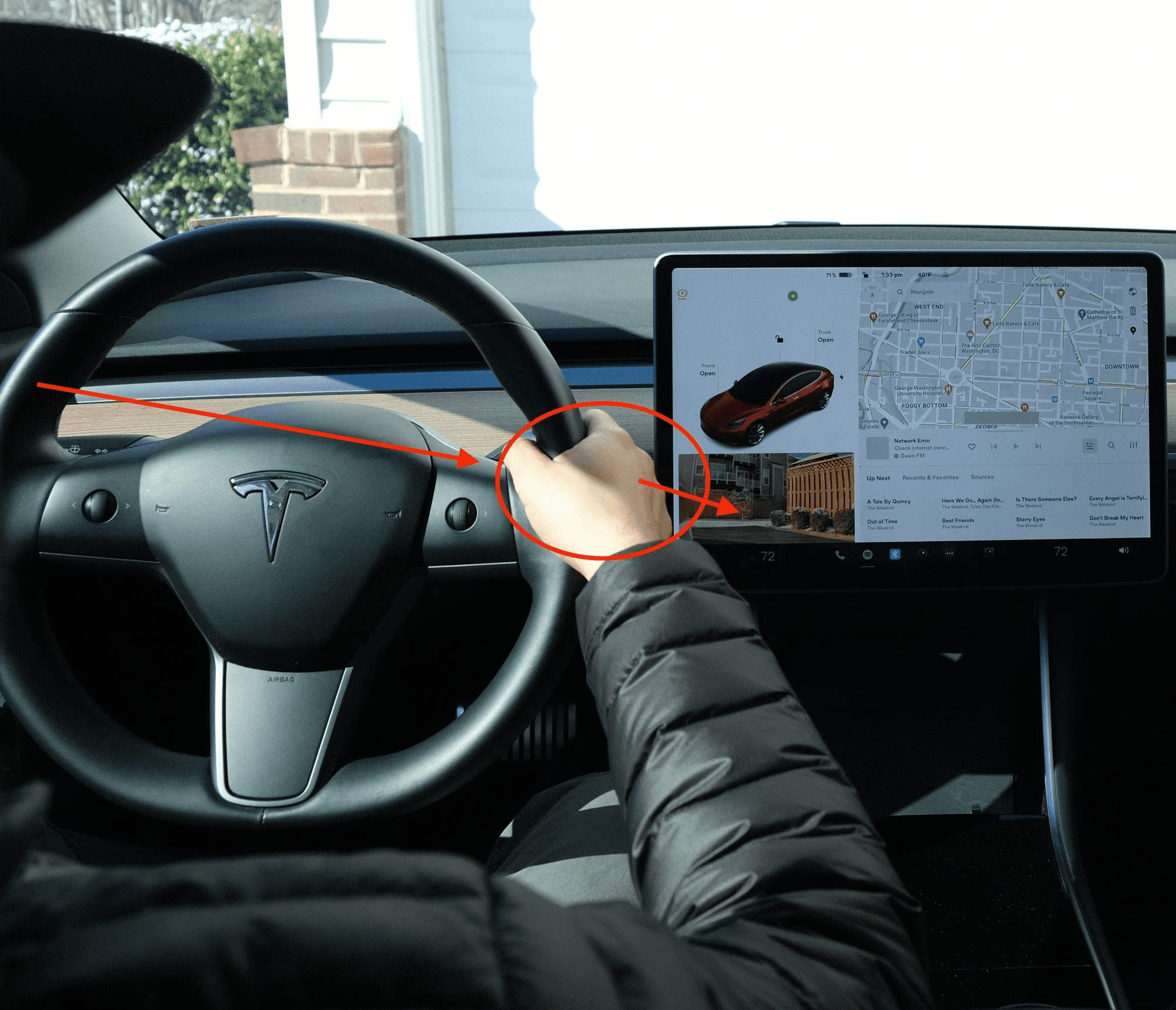
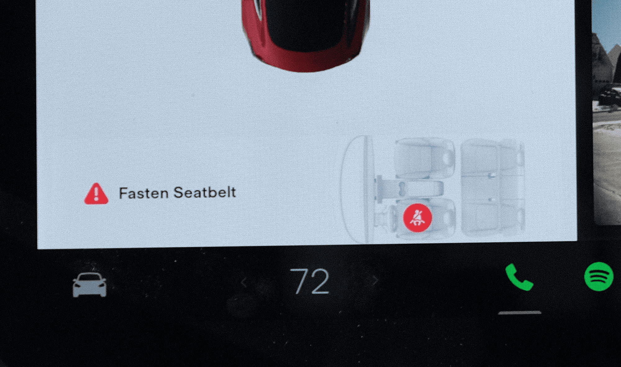
HomeLink Garage controls, Seat Belt alerts, and the climate “Quick Menu,” can be blocked due to this positioning.
Sliders vs Incremental Stepper
The author continued to find the design choice of adjusting the A/C fan speed via a slider in V11 result in the most error and difficulty compared to any other design change.
Sliding to a specific value while driving is impractical for a couple of reasons:
The additional motion of the vehicle moving (bouncing, turning, etc.) makes finding and accurately moving the slider more difficult vs a stationary tablet.
With such a finite number of fan speeds, tapping an incremental stepper like what V10 had is a reliable mechanical motion (putting aside that physical controls here would be superior, but is against Tesla’s ethos).

V10’s Climate Menu top row with fan speed as an incremental stepper Tesla’s tutorial videos

V11’s Climate Menu top row with fan speed as a slider
Swipe Gestures
Swipe-down-to-dismiss gestures are useful in navigating software that have multiple menus and modals of interface. However, gestures should be paired with an explicit “close” button to be truly accessible.
One one hand, performing this swipe-down while driving manually generally should be easier than reaching for a specific touch target. However, the mechanic needing that much downward swiping is not what would be considered an ergonomic movement.
Homogenized UI
“Quick” Controls
V10’s Quick Controls menu uses sectioning to aptly group and physically space out a variety of control types of different shapes and sizes. Quick Controls appears after tapping the Car icon furthest left in the Bottom Bar. Fun tidbit: the icon’s shape will reflect the Tesla model it is shown in.
V10’s Quick Controls via Tesla’s tutorial videos
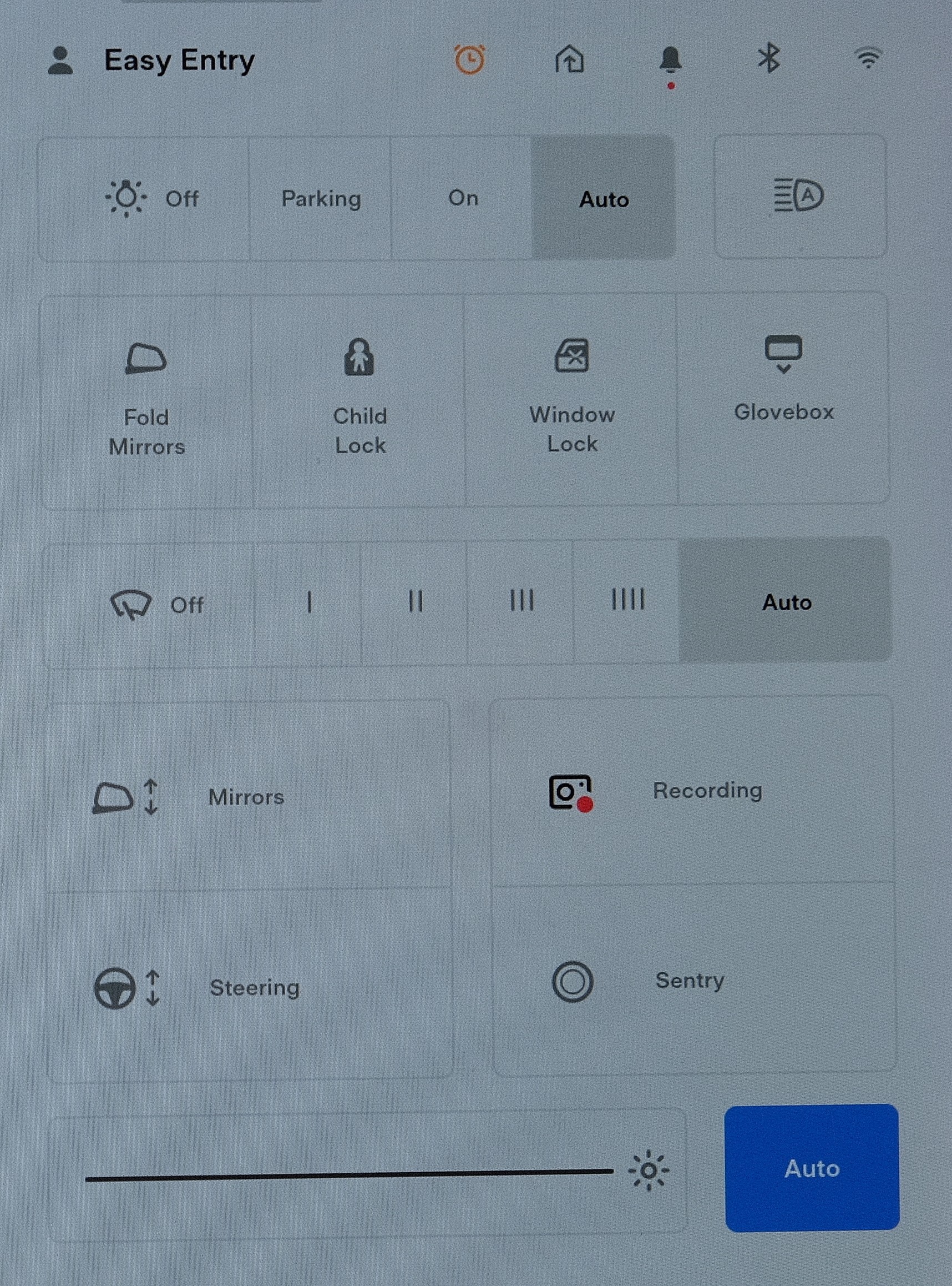
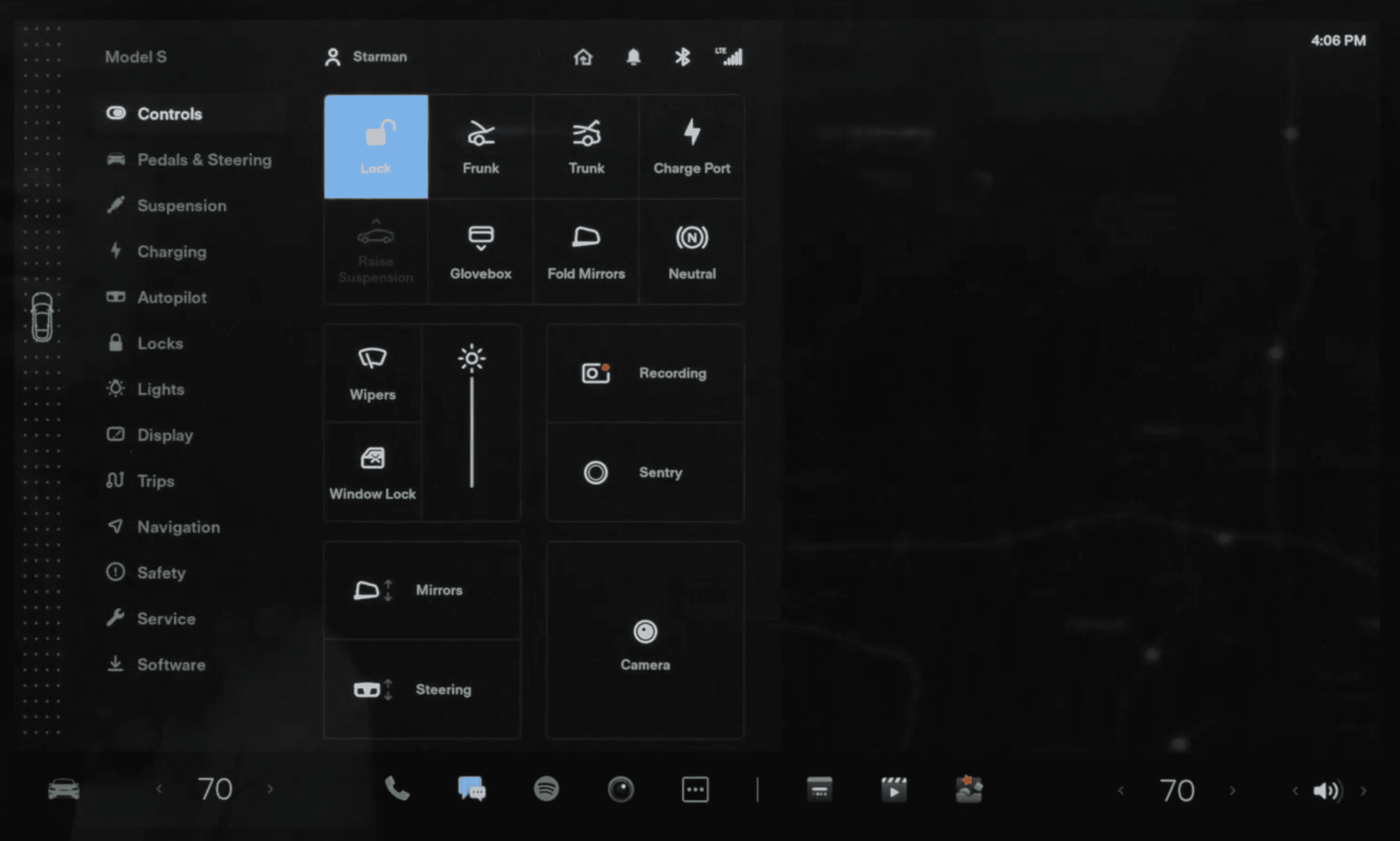
V11 below renames this area into “Controls,” and uses a flat, block language for all buttons, and arbitrary grouping without labels.
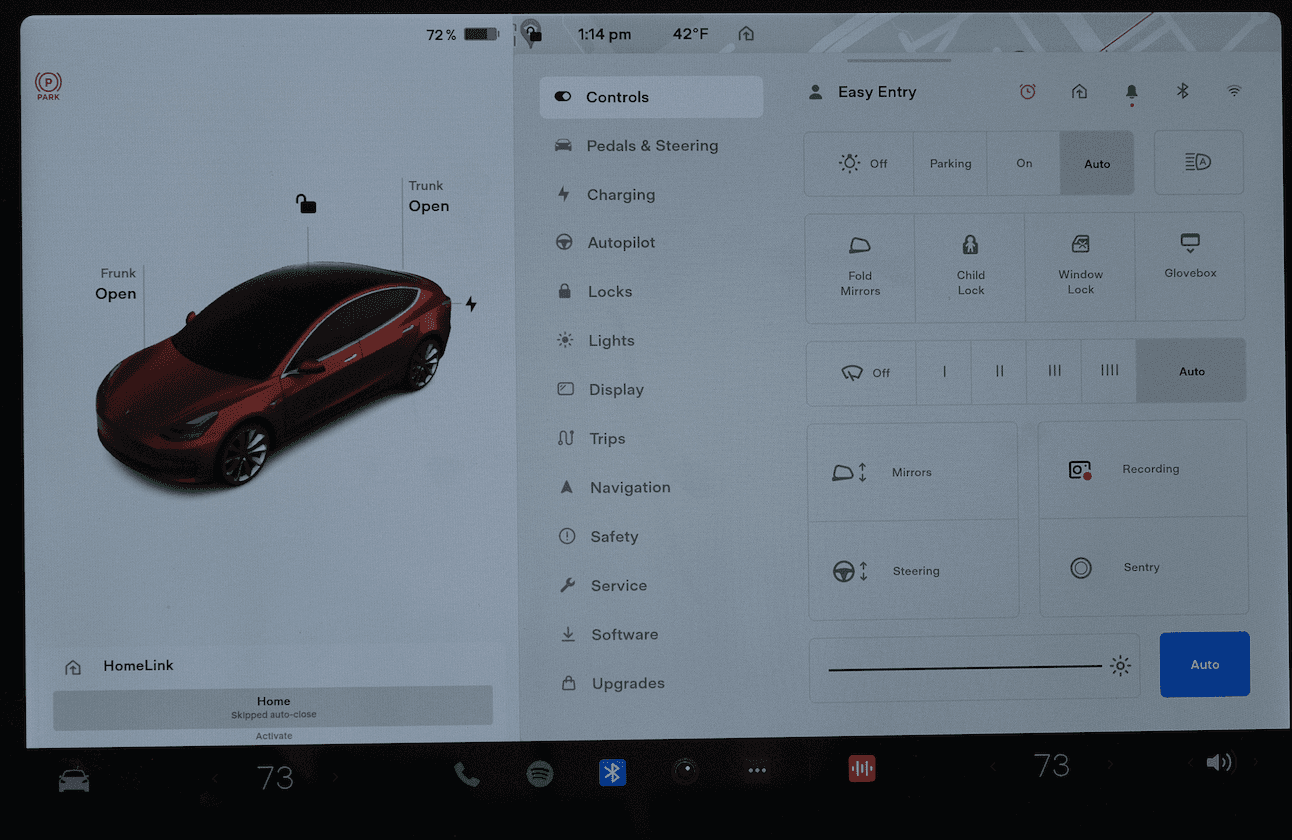
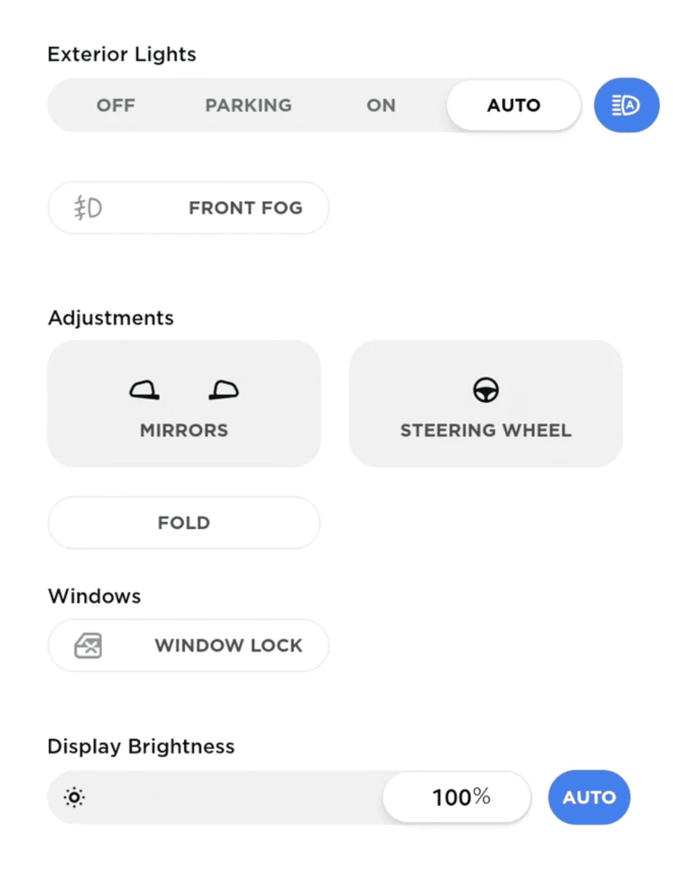
V11’s Controls Menu
In further comparison below, it can be seen how many contextual cues V10’s design language had for Quick Controls:
V10’s Quick Controls via Tesla’s tutorial videos
V11’s Controls
V10’s Controls had clear labels to define the multiple sections of controls, sliders to show the related spectrum of settings per component, rounded buttons for singular actions, and gray-background-colored buttons for the two settings that would result in a pop up screen for further configuration.
Auto selection for Lights and Wipers in V11 have a gray fill, whereas the screen’s brightness Auto section has a grey fill, adding more logic for determining what is selected. There’s only the contextual hint of an icon to indicate the function of some blocks.
V11 adds Dashcam, Sentry Mode, and Wiper controls, the former two being previously persistent in V10’s Status Bar.
Observe the stark difference in contextual design between V10 and V11 on a Model S below:
V11 on a 2021 Model S via Tesla’s tutorial videos
V10 on a pre-2021 Model S Via Tesla’s tutorial videos
In previous software iterations, Tesla used 3D Model S renderings to show relative controls. Now, it resorts to a homogenized grid of buttons with no strong sense of grouping between blocks of buttons.
Climate
V10 and V11 share similar arrangements for the Climate menu UI. The shapes of the buttons are different, but the grouping and placement are there. If you power off the climate system, both iterations of the Climate menu have the quirk of automatically turning the system on just by opening this or the “Quick Menu,” even to adjust the seat heaters.
V10’s Climate menu via Tesla’s tutorial videos
V11’s Climate menu
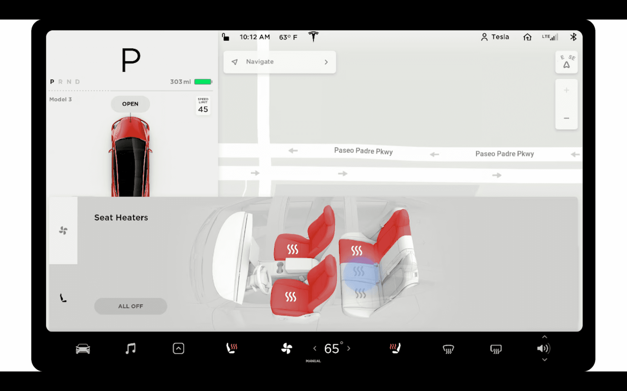
Where V10’s Climate menu had climate and seat heater sections, V11 repurposes them to front and rear control along with adding labels to the icons of the two tabs. The rear controls screen now has a rear fan button and limits the use of the expansive, detailed interior graphic for only control the rear row’s three heated seats.
Previously, V10 had the rear fan as a button on the lower right corner of the Climate menu. The information architecture feels incomplete here - as if it was purposed towards a more complex, feature-rich car like the Model X.
V10’s Climate menu seats tab via Tesla’s tutorial videos

V11’s Climate menu rear seats tab
Media Player
V10 uses what is likely a one pixel-thick line to be the status and scrubber for actively playing media. There have been numerous occasions where this scrubber would not respond to user input, let aside zero contextual cues for its interactability.
V11’s nearly impossible to see media progress/scrubber when in compact form.
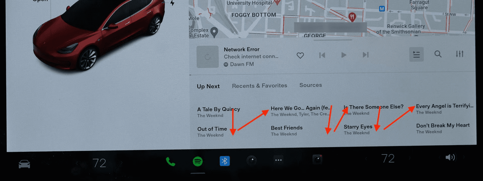
V11’s media player has a “semi compact” view that can show the active queue of music. It isn’t immediately intuitive whether the queue’s order goes from left to right and then top to bottom, or as the actual sequence: zig-zagging from the first “column” of songs.
Tabs
Prominently used in the audio apps, Tesla continues V10’s design of using slight color changes and font weight increases to indicate the selected tab.
Symptomatic of a design industry as a whole utilizing this pattern, there are far more effective, contextually clear alternatives that may not follow as minimal of an appears as these tabs do.

V11’s Spotify tabs
Ambiguity
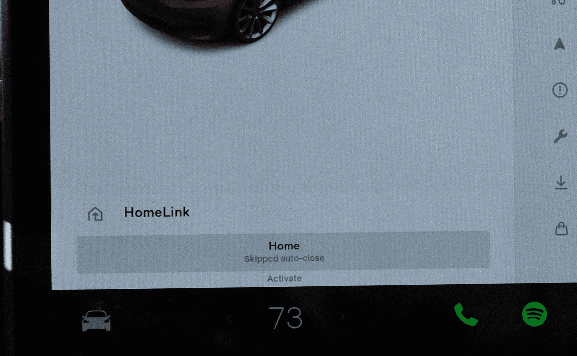
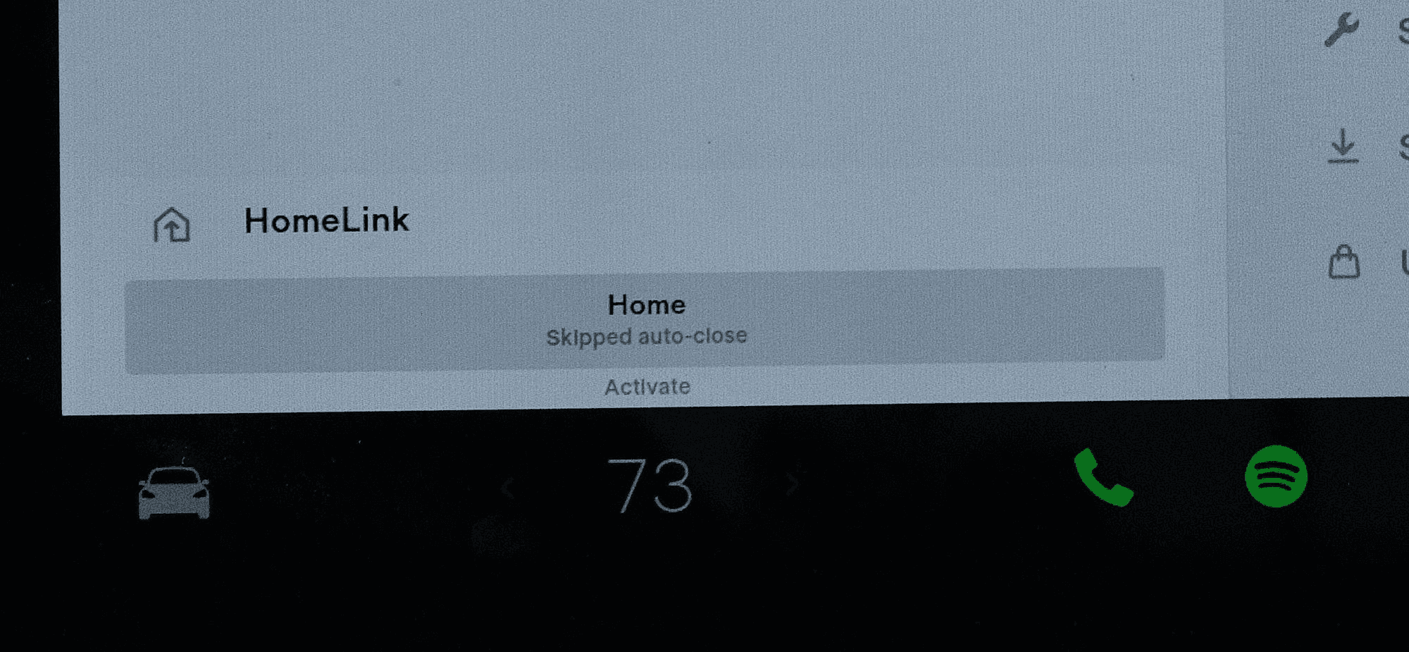
The HomeLink button has text underneath that may or may not be a button and a status label. After two months of use, the author is still unclear. Buttons should have the simplest signal-to-noise ratio. If there’s too much complexity, it should be another UI component.
At least we have customizable light shows now? 🤷🏽♂️
Supplemental Information
🗒️ Note: Tesla is able to send over the air updates to their cars that may remedy issues highlighted in this post. As of this writing, V11 2022.4.5.3 is the most recent version running on the author’s Model 3.
V11’s design update affects all Model 3, Y, and 2021 and beyond Model S and X’s.
V11 via Tesla’s tutorial videos
The Gist
Tesla is on another planet when it comes to how refined and capable their vehicle’s infotainment systems are. Since 2012’s Model S, Tesla owners have had the unique luxury of getting continuous software updates that added more features over time.
Nine years later December 2021’s V11 update resulted in a sleeker, simplified UI that resulted in a far less practical design as it buried basic functionality behind multiple menus.
Given Tesla’s minimalist design resulting in very few physical controls, most vehicle controls live on the center touchscreen. A less usable interface makes for a tougher driving experience. Many Tesla owners have taken notice of this.
After two months of use, this author reaffirms his initials thoughts: V11 takes a big step back in basic usability because of its minimalist design choices.
There’s three primary issues with V11’s design:
Burying numerous, previously glanceable and reachable items into menus such as “Quick” Controls requiring extra taps, and removing heated seats and defrost controls from the bottom bar
Ergonomics, or lack thereof, for the new alerts and gestures that are blocked by the steering wheel
Homogenized UI from previously distinguished buttons/actions, making for a greater cognitive load from the driver to distinguish between a grid of buttons
Context
As a first for the auto industry, since 2012 Tesla can update their vehicles over the internet. No dealership service center needed! Ten years later, Tesla still has a significant lead over the traditional auto industry on their infotainment software (and battery + drivetrain tech for now). Some new features created over the years include:
Using the Autopilot cameras as dashcams
Navigating through streetlights and stop signs on Autopilot
Semiautonomous lane changing and highway exit ramps
Cheetah mode launch stance for performance Model S
Stream Netflix, Hulu, YouTube, and Disney+ while parked
An arcade-worth of classic and new video games playable while parked
Spotify app
Optimize the battery when navigating to a Supercharger
Cold Weather improvements
These only scratch the surface of Tesla’s software chops and granular level of control over every electronic in their cars. Many feature ideas are also crowdsourced by Elon Musk himself and Tesla through Twitter and Reddit.
Until 2021’s introduction of the current Model S and X iteration, the previous models had portrait-oriented Media Control Units, or MCUs as Tesla refers to them - aka the big touchscreen in a Tesla. Model 3 and Y had landscape-oriented MCU’s as shown below:
V9 on Model S & X via Tesla Support
V9 on Model 3 via Tesla Support
V11 marks the first software iteration that had landscape designs align the new Model S and X with the Model 3 and Y. Note that Model S and X still retain the screen behind the steering wheel, similar to most cars.
V11 on 2021 Model S via Tesla’s tutorial videos
V11 on a 2018 Model 3
V11 comes with new additions that continues to showcase Tesla’s significant lead in software sophistication in the auto industry: video game Sonic the Hedgehog, multiple waypoints navigation, customizable immersive audio settings, and even a light show.
Traditional auto makers are at the beginning stages of figuring out how to do over the air updates, and create digital interfaces that incorporate the level of high-fidelity Design Thinking Tesla has done. Meanwhile, two new American EV companies Rivian and Lucid have recently begun deliveries of their first highly rated EV’s, both with well-crafted digital interfaces capable of receiving over the air updates.
Tesla will soon have more competition than ever for digital interface experiences.
Musings
So much of the design changes detailed in sections below point back to 1) an action taking more steps than it was previously, and 2) being more difficult to perform while driving. Are such things tested in the field when prototyping new designs?
V11 may be the apex of Tesla designing for UI, and sacrificing UX to do so. There’s a lack of consideration of non-Bay Area, SoCal climates that merit frequent use of the windshield defroster and seat heaters.
Decisions like putting the Charging menu inside of the monolith Controls menu shows the sacrifice of not weighting the information architecture in favor of significantly streamlining the interface.
Tesla has been the only vehicle maker who has sold vehicles with the potential capability of being fully autonomous someday. Today, a select portion of owners have a beta build of Full Self Driving, or FSD - Tesla’s current most advance version of Autopilot capable of driving in urban and suburban terrain that still requires an attentive human.
Autopilot and the pursuit of FSD’s final form has influenced Tesla’s digital interfaces for the last few years. In response to a design suggestion for V11, Musk responded, “Almost all input is error.”
If Teslas will be autonomous robotaxis, why then would someone need to adjust their AC or have a convenient button to see the Charging menu?
Realistically, we’re still years away from that possibility. Our digital interface experiences shouldn’t suffer during that pursuit.
Buried
Trip & Tire Pressure
Trip Information and Tire information was previously reachable in the lower right area of the screen, inside of the left area of the screen dedicated to all driving-related, active data. A swipe to the left or right in this area revealed the respective “card.”
V10 via Tesla’s tutorial videos
Now, in V11, Trip Info and Tire Pressure live in their own sub pages inside the Controls menu, which now houses Dashcam Status, Sentry Mode Status, Vehicle Notifications, Bluetooth, Cellular/Wifi Bars, and Driver Profile.
Additional taps, and more cognitive attention is needed to get to Trip Info and Tire Pressure. This can translate to time not spent looking at the road while driving (remember, Tesla’s aren’t fully autonomous), making for a less safe drive.
V11, Service screen where Tire Pressure now lives (not shown when vehicle is parked)
V11, Trips Screen
Bottom Bar
V10 and previous versions retained common vehicle controls on its bottom bar: defrost controls, seat heaters, and access to the wiper controls. In dark conditions, the MCU switches to dark mode, along with the color of the Bottom Bar changing.
V10, Bottom Bar via Tesla’s tutorial videos
V11, Bottom Bar
V11 undergoes an ethos of vehicle function minimalism while brining prominence to music streaming services, games, and apps - the latter two are generally unavailable while driving. The always-dark design appears sleek at initial glance, yet can be of detriment in certain lighting conditions and for recognizing the darker colored app icons. Gone are the defrost controls and seat heater controls, now tucked behind a “quick menu” and embedded into the main Climate Control view.
Status Bar
Driver profile, which stores seat, steering wheel, and mirror position along with vehicle settings such as Autopilot preferences, along with HomeLink garage controls, notifications, software update alerts, Dashcam, Sentry Mode, Bluetooth, and Cellular/Wifi connectivity are now inside of the Controls menu.
Accessing any of these functions now requires the extra tap of opening the Controls menu, in which doing so would block the Map view or any previously opened app such as Spotify.
V10’s Status Bar via Tesla’s tutorial videos
V11’s Status Bar
Climate Controls
The climate “Quick Menu” appears after tapping or swiping left or right on the temperature on the Bottom Bar. Seat heater and defrost controls are found here, along with a new Auto mode for seat heaters based on the interior temperature.
Even two months later, reading and interacting with these controls while manually driving, and even on Autopilot, feels disorienting.
Shown below, the seat heater and defrost controls found in the climate “Quick Menu” are also found in the main Climate Controls menu that largely retains its layout to V10 now with squared buttons and toggles.
V11 Climate Controls menu
Charging
The Charging menu was previously displayed as its own screen, and reachable by the Bottom Bar’s “extra” menu, and tapping the charge port when parked.
V10 Charging menu via Tesla’s tutorial videos
Charging in V11 is found in the Controls menu as its own section, with a smaller window of information.
V11 Charging menu
Ergonomics, or Lack Thereof
Blocked: Turn Signal, Alerts, and Climate Control
V11 introduced the ability to use the side fender cameras as a blind spot monitor when the turn signal activated. It was a much-requested feature by owners.
V11’s implementation of it, and other temporary alerts in the lower left corner of the MCU result in the driver generally being unable to view them as his hand and the steering wheel would block it.
HomeLink Garage controls, Seat Belt alerts, and the climate “Quick Menu,” can be blocked due to this positioning.
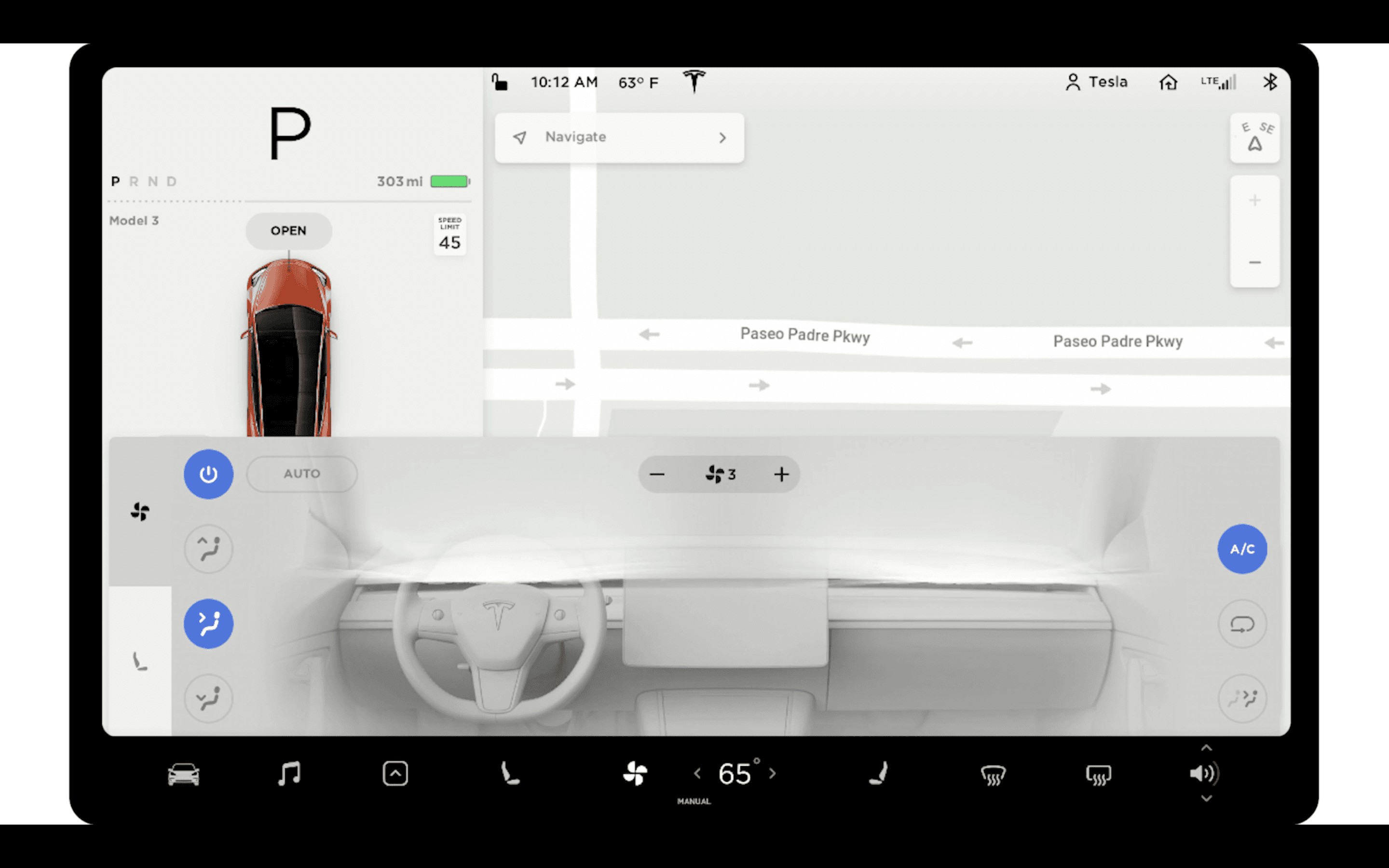
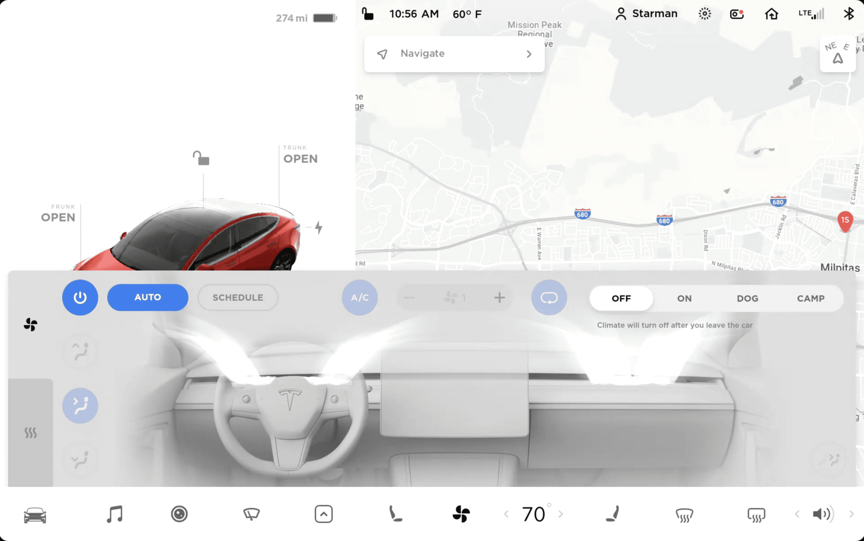
Sliders vs Incremental Stepper
The author continued to find the design choice of adjusting the A/C fan speed via a slider in V11 result in the most error and difficulty compared to any other design change.
Sliding to a specific value while driving is impractical for a couple of reasons:
The additional motion of the vehicle moving (bouncing, turning, etc.) makes finding and accurately moving the slider more difficult vs a stationary tablet.
With such a finite number of fan speeds, tapping an incremental stepper like what V10 had is a reliable mechanical motion (putting aside that physical controls here would be superior, but is against Tesla’s ethos).
V10’s Climate Menu top row with fan speed as an incremental stepper Tesla’s tutorial videos
V11’s Climate Menu top row with fan speed as a slider
Swipe Gestures
Swipe-down-to-dismiss gestures are useful in navigating software that have multiple menus and modals of interface. However, gestures should be paired with an explicit “close” button to be truly accessible.
One one hand, performing this swipe-down while driving manually generally should be easier than reaching for a specific touch target. However, the mechanic needing that much downward swiping is not what would be considered an ergonomic movement.
Homogenized UI
“Quick” Controls
V10’s Quick Controls menu uses sectioning to aptly group and physically space out a variety of control types of different shapes and sizes. Quick Controls appears after tapping the Car icon furthest left in the Bottom Bar. Fun tidbit: the icon’s shape will reflect the Tesla model it is shown in.
V10’s Quick Controls via Tesla’s tutorial videos
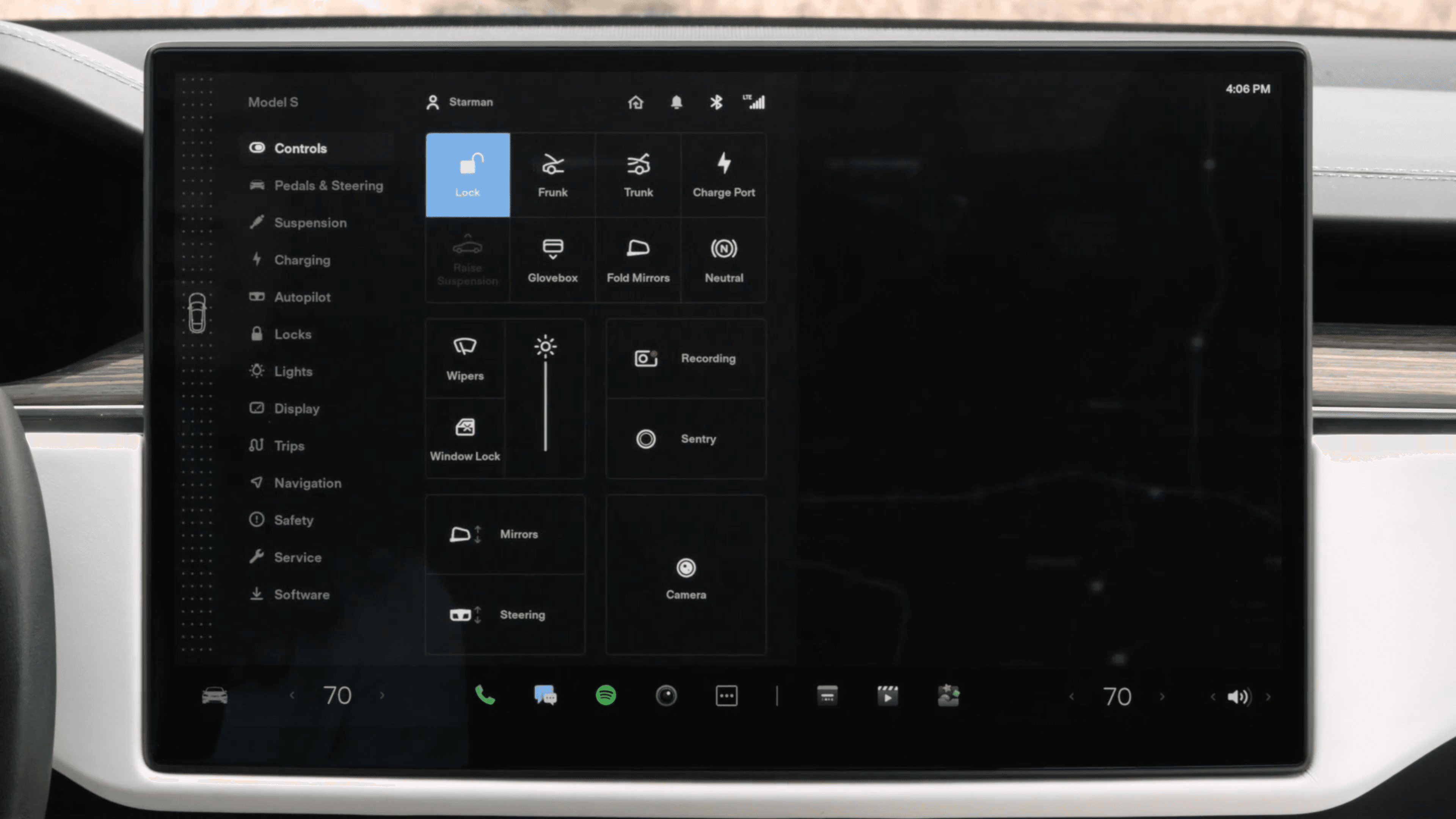
V11 below renames this area into “Controls,” and uses a flat, block language for all buttons, and arbitrary grouping without labels.
V11’s Controls Menu
In further comparison below, it can be seen how many contextual cues V10’s design language had for Quick Controls:
V10’s Quick Controls via Tesla’s tutorial videos
V11’s Controls
V10’s Controls had clear labels to define the multiple sections of controls, sliders to show the related spectrum of settings per component, rounded buttons for singular actions, and gray-background-colored buttons for the two settings that would result in a pop up screen for further configuration.
Auto selection for Lights and Wipers in V11 have a gray fill, whereas the screen’s brightness Auto section has a grey fill, adding more logic for determining what is selected. There’s only the contextual hint of an icon to indicate the function of some blocks.
V11 adds Dashcam, Sentry Mode, and Wiper controls, the former two being previously persistent in V10’s Status Bar.
Observe the stark difference in contextual design between V10 and V11 on a Model S below:
V11 on a 2021 Model S via Tesla’s tutorial videos
V10 on a pre-2021 Model S Via Tesla’s tutorial videos
In previous software iterations, Tesla used 3D Model S renderings to show relative controls. Now, it resorts to a homogenized grid of buttons with no strong sense of grouping between blocks of buttons.
Climate
V10 and V11 share similar arrangements for the Climate menu UI. The shapes of the buttons are different, but the grouping and placement are there. If you power off the climate system, both iterations of the Climate menu have the quirk of automatically turning the system on just by opening this or the “Quick Menu,” even to adjust the seat heaters.
V10’s Climate menu via Tesla’s tutorial videos
V11’s Climate menu
Where V10’s Climate menu had climate and seat heater sections, V11 repurposes them to front and rear control along with adding labels to the icons of the two tabs. The rear controls screen now has a rear fan button and limits the use of the expansive, detailed interior graphic for only control the rear row’s three heated seats.
Previously, V10 had the rear fan as a button on the lower right corner of the Climate menu. The information architecture feels incomplete here - as if it was purposed towards a more complex, feature-rich car like the Model X.
V10’s Climate menu seats tab via Tesla’s tutorial videos
V11’s Climate menu rear seats tab
Media Player
V10 uses what is likely a one pixel-thick line to be the status and scrubber for actively playing media. There have been numerous occasions where this scrubber would not respond to user input, let aside zero contextual cues for its interactability.
V11’s nearly impossible to see media progress/scrubber when in compact form.
V11’s media player has a “semi compact” view that can show the active queue of music. It isn’t immediately intuitive whether the queue’s order goes from left to right and then top to bottom, or as the actual sequence: zig-zagging from the first “column” of songs.
Tabs
Prominently used in the audio apps, Tesla continues V10’s design of using slight color changes and font weight increases to indicate the selected tab.
Symptomatic of a design industry as a whole utilizing this pattern, there are far more effective, contextually clear alternatives that may not follow as minimal of an appears as these tabs do.
V11’s Spotify tabs
Ambiguity
The HomeLink button has text underneath that may or may not be a button and a status label. After two months of use, the author is still unclear. Buttons should have the simplest signal-to-noise ratio. If there’s too much complexity, it should be another UI component.
At least we have customizable light shows now? 🤷🏽♂️
Supplemental Information
🗒️ Note: Tesla is able to send over the air updates to their cars that may remedy issues highlighted in this post. As of this writing, V11 2022.4.5.3 is the most recent version running on the author’s Model 3.
V11’s design update affects all Model 3, Y, and 2021 and beyond Model S and X’s.
V11 via Tesla’s tutorial videos
The Gist
Tesla is on another planet when it comes to how refined and capable their vehicle’s infotainment systems are. Since 2012’s Model S, Tesla owners have had the unique luxury of getting continuous software updates that added more features over time.
Nine years later December 2021’s V11 update resulted in a sleeker, simplified UI that resulted in a far less practical design as it buried basic functionality behind multiple menus.
Given Tesla’s minimalist design resulting in very few physical controls, most vehicle controls live on the center touchscreen. A less usable interface makes for a tougher driving experience. Many Tesla owners have taken notice of this.
After two months of use, this author reaffirms his initials thoughts: V11 takes a big step back in basic usability because of its minimalist design choices.
There’s three primary issues with V11’s design:
Burying numerous, previously glanceable and reachable items into menus such as “Quick” Controls requiring extra taps, and removing heated seats and defrost controls from the bottom bar
Ergonomics, or lack thereof, for the new alerts and gestures that are blocked by the steering wheel
Homogenized UI from previously distinguished buttons/actions, making for a greater cognitive load from the driver to distinguish between a grid of buttons
Context
As a first for the auto industry, since 2012 Tesla can update their vehicles over the internet. No dealership service center needed! Ten years later, Tesla still has a significant lead over the traditional auto industry on their infotainment software (and battery + drivetrain tech for now). Some new features created over the years include:
Using the Autopilot cameras as dashcams
Navigating through streetlights and stop signs on Autopilot
Semiautonomous lane changing and highway exit ramps
Cheetah mode launch stance for performance Model S
Stream Netflix, Hulu, YouTube, and Disney+ while parked
An arcade-worth of classic and new video games playable while parked
Spotify app
Optimize the battery when navigating to a Supercharger
Cold Weather improvements
These only scratch the surface of Tesla’s software chops and granular level of control over every electronic in their cars. Many feature ideas are also crowdsourced by Elon Musk himself and Tesla through Twitter and Reddit.
Until 2021’s introduction of the current Model S and X iteration, the previous models had portrait-oriented Media Control Units, or MCUs as Tesla refers to them - aka the big touchscreen in a Tesla. Model 3 and Y had landscape-oriented MCU’s as shown below:
V9 on Model S & X via Tesla Support
V9 on Model 3 via Tesla Support
V11 marks the first software iteration that had landscape designs align the new Model S and X with the Model 3 and Y. Note that Model S and X still retain the screen behind the steering wheel, similar to most cars.
V11 on 2021 Model S via Tesla’s tutorial videos
V11 on a 2018 Model 3
V11 comes with new additions that continues to showcase Tesla’s significant lead in software sophistication in the auto industry: video game Sonic the Hedgehog, multiple waypoints navigation, customizable immersive audio settings, and even a light show.
Traditional auto makers are at the beginning stages of figuring out how to do over the air updates, and create digital interfaces that incorporate the level of high-fidelity Design Thinking Tesla has done. Meanwhile, two new American EV companies Rivian and Lucid have recently begun deliveries of their first highly rated EV’s, both with well-crafted digital interfaces capable of receiving over the air updates.
Tesla will soon have more competition than ever for digital interface experiences.
Musings
So much of the design changes detailed in sections below point back to 1) an action taking more steps than it was previously, and 2) being more difficult to perform while driving. Are such things tested in the field when prototyping new designs?
V11 may be the apex of Tesla designing for UI, and sacrificing UX to do so. There’s a lack of consideration of non-Bay Area, SoCal climates that merit frequent use of the windshield defroster and seat heaters.
Decisions like putting the Charging menu inside of the monolith Controls menu shows the sacrifice of not weighting the information architecture in favor of significantly streamlining the interface.
Tesla has been the only vehicle maker who has sold vehicles with the potential capability of being fully autonomous someday. Today, a select portion of owners have a beta build of Full Self Driving, or FSD - Tesla’s current most advance version of Autopilot capable of driving in urban and suburban terrain that still requires an attentive human.
Autopilot and the pursuit of FSD’s final form has influenced Tesla’s digital interfaces for the last few years. In response to a design suggestion for V11, Musk responded, “Almost all input is error.”
If Teslas will be autonomous robotaxis, why then would someone need to adjust their AC or have a convenient button to see the Charging menu?
Realistically, we’re still years away from that possibility. Our digital interface experiences shouldn’t suffer during that pursuit.
Buried
Trip & Tire Pressure
Trip Information and Tire information was previously reachable in the lower right area of the screen, inside of the left area of the screen dedicated to all driving-related, active data. A swipe to the left or right in this area revealed the respective “card.”
V10 via Tesla’s tutorial videos
Now, in V11, Trip Info and Tire Pressure live in their own sub pages inside the Controls menu, which now houses Dashcam Status, Sentry Mode Status, Vehicle Notifications, Bluetooth, Cellular/Wifi Bars, and Driver Profile.
Additional taps, and more cognitive attention is needed to get to Trip Info and Tire Pressure. This can translate to time not spent looking at the road while driving (remember, Tesla’s aren’t fully autonomous), making for a less safe drive.
V11, Service screen where Tire Pressure now lives (not shown when vehicle is parked)
V11, Trips Screen
Bottom Bar
V10 and previous versions retained common vehicle controls on its bottom bar: defrost controls, seat heaters, and access to the wiper controls. In dark conditions, the MCU switches to dark mode, along with the color of the Bottom Bar changing.
V10, Bottom Bar via Tesla’s tutorial videos
V11, Bottom Bar
V11 undergoes an ethos of vehicle function minimalism while brining prominence to music streaming services, games, and apps - the latter two are generally unavailable while driving. The always-dark design appears sleek at initial glance, yet can be of detriment in certain lighting conditions and for recognizing the darker colored app icons. Gone are the defrost controls and seat heater controls, now tucked behind a “quick menu” and embedded into the main Climate Control view.
Status Bar
Driver profile, which stores seat, steering wheel, and mirror position along with vehicle settings such as Autopilot preferences, along with HomeLink garage controls, notifications, software update alerts, Dashcam, Sentry Mode, Bluetooth, and Cellular/Wifi connectivity are now inside of the Controls menu.
Accessing any of these functions now requires the extra tap of opening the Controls menu, in which doing so would block the Map view or any previously opened app such as Spotify.
V10’s Status Bar via Tesla’s tutorial videos
V11’s Status Bar
Climate Controls
The climate “Quick Menu” appears after tapping or swiping left or right on the temperature on the Bottom Bar. Seat heater and defrost controls are found here, along with a new Auto mode for seat heaters based on the interior temperature.
Even two months later, reading and interacting with these controls while manually driving, and even on Autopilot, feels disorienting.
Shown below, the seat heater and defrost controls found in the climate “Quick Menu” are also found in the main Climate Controls menu that largely retains its layout to V10 now with squared buttons and toggles.
V11 Climate Controls menu
Charging
The Charging menu was previously displayed as its own screen, and reachable by the Bottom Bar’s “extra” menu, and tapping the charge port when parked.
V10 Charging menu via Tesla’s tutorial videos
Charging in V11 is found in the Controls menu as its own section, with a smaller window of information.
V11 Charging menu
Ergonomics, or Lack Thereof
Blocked: Turn Signal, Alerts, and Climate Control
V11 introduced the ability to use the side fender cameras as a blind spot monitor when the turn signal activated. It was a much-requested feature by owners.
V11’s implementation of it, and other temporary alerts in the lower left corner of the MCU result in the driver generally being unable to view them as his hand and the steering wheel would block it.
HomeLink Garage controls, Seat Belt alerts, and the climate “Quick Menu,” can be blocked due to this positioning.
Sliders vs Incremental Stepper
The author continued to find the design choice of adjusting the A/C fan speed via a slider in V11 result in the most error and difficulty compared to any other design change.
Sliding to a specific value while driving is impractical for a couple of reasons:
The additional motion of the vehicle moving (bouncing, turning, etc.) makes finding and accurately moving the slider more difficult vs a stationary tablet.
With such a finite number of fan speeds, tapping an incremental stepper like what V10 had is a reliable mechanical motion (putting aside that physical controls here would be superior, but is against Tesla’s ethos).
V10’s Climate Menu top row with fan speed as an incremental stepper Tesla’s tutorial videos
V11’s Climate Menu top row with fan speed as a slider
Swipe Gestures
Swipe-down-to-dismiss gestures are useful in navigating software that have multiple menus and modals of interface. However, gestures should be paired with an explicit “close” button to be truly accessible.
One one hand, performing this swipe-down while driving manually generally should be easier than reaching for a specific touch target. However, the mechanic needing that much downward swiping is not what would be considered an ergonomic movement.
Homogenized UI
“Quick” Controls
V10’s Quick Controls menu uses sectioning to aptly group and physically space out a variety of control types of different shapes and sizes. Quick Controls appears after tapping the Car icon furthest left in the Bottom Bar. Fun tidbit: the icon’s shape will reflect the Tesla model it is shown in.
V10’s Quick Controls via Tesla’s tutorial videos
V11 below renames this area into “Controls,” and uses a flat, block language for all buttons, and arbitrary grouping without labels.
V11’s Controls Menu
In further comparison below, it can be seen how many contextual cues V10’s design language had for Quick Controls:
V10’s Quick Controls via Tesla’s tutorial videos
V11’s Controls
V10’s Controls had clear labels to define the multiple sections of controls, sliders to show the related spectrum of settings per component, rounded buttons for singular actions, and gray-background-colored buttons for the two settings that would result in a pop up screen for further configuration.
Auto selection for Lights and Wipers in V11 have a gray fill, whereas the screen’s brightness Auto section has a grey fill, adding more logic for determining what is selected. There’s only the contextual hint of an icon to indicate the function of some blocks.
V11 adds Dashcam, Sentry Mode, and Wiper controls, the former two being previously persistent in V10’s Status Bar.
Observe the stark difference in contextual design between V10 and V11 on a Model S below:
V11 on a 2021 Model S via Tesla’s tutorial videos
V10 on a pre-2021 Model S Via Tesla’s tutorial videos
In previous software iterations, Tesla used 3D Model S renderings to show relative controls. Now, it resorts to a homogenized grid of buttons with no strong sense of grouping between blocks of buttons.
Climate
V10 and V11 share similar arrangements for the Climate menu UI. The shapes of the buttons are different, but the grouping and placement are there. If you power off the climate system, both iterations of the Climate menu have the quirk of automatically turning the system on just by opening this or the “Quick Menu,” even to adjust the seat heaters.
V10’s Climate menu via Tesla’s tutorial videos
V11’s Climate menu
Where V10’s Climate menu had climate and seat heater sections, V11 repurposes them to front and rear control along with adding labels to the icons of the two tabs. The rear controls screen now has a rear fan button and limits the use of the expansive, detailed interior graphic for only control the rear row’s three heated seats.
Previously, V10 had the rear fan as a button on the lower right corner of the Climate menu. The information architecture feels incomplete here - as if it was purposed towards a more complex, feature-rich car like the Model X.
V10’s Climate menu seats tab via Tesla’s tutorial videos
V11’s Climate menu rear seats tab
Media Player
V10 uses what is likely a one pixel-thick line to be the status and scrubber for actively playing media. There have been numerous occasions where this scrubber would not respond to user input, let aside zero contextual cues for its interactability.
V11’s nearly impossible to see media progress/scrubber when in compact form.
V11’s media player has a “semi compact” view that can show the active queue of music. It isn’t immediately intuitive whether the queue’s order goes from left to right and then top to bottom, or as the actual sequence: zig-zagging from the first “column” of songs.
Tabs
Prominently used in the audio apps, Tesla continues V10’s design of using slight color changes and font weight increases to indicate the selected tab.
Symptomatic of a design industry as a whole utilizing this pattern, there are far more effective, contextually clear alternatives that may not follow as minimal of an appears as these tabs do.
V11’s Spotify tabs
Ambiguity
The HomeLink button has text underneath that may or may not be a button and a status label. After two months of use, the author is still unclear. Buttons should have the simplest signal-to-noise ratio. If there’s too much complexity, it should be another UI component.
At least we have customizable light shows now? 🤷🏽♂️
Supplemental Information
© Ravi Gangele 2023
© Ravi Gangele 2023